
Shopify
08 min read
How to Structure Shopify Navigation for Maximum Sales (2026)
February 18, 2026 · 8 min read · Ecommerce
The Core Rules Before You Read On
Organize by how customers think — use cases and intent, not your internal inventory logic
5–7 top-level items maximum — no more than 3 levels deep before cognitive load kills conversions
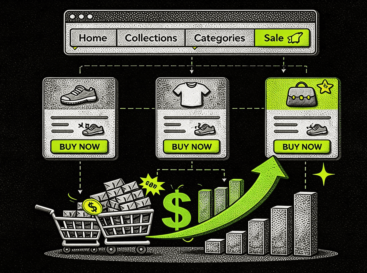
Position high-margin products in slots 2–4 — attention drops sharply after item 5
Search converts 2–3x higher than menu navigation — make it prominent and predictive
Mobile navigation is a different design problem — not a scaled-down version of desktop
Test one variable at a time — category order, label wording, and mega menu layout are separate experiments
Most Shopify store owners build their navigation in the first week and never revisit it. The categories made sense during setup — organized by vendor, collection type, or how inventory arrived. Then conversion data tells a different story: customers abandon carts, bounce rates climb, and support tickets reveal confusion about where basic products live.
The problem is rarely bad products or weak marketing. Research from the Baymard Institute shows that 37% of online shoppers abandon purchases due to poor navigation and search functionality. When customers cannot find what they need within seconds, they leave — and they rarely come back. A properly structured Shopify navigation system does not just organize products. It guides purchasing decisions, reduces friction, and creates clear pathways from discovery to checkout.
37%
of shoppers abandon purchases due to poor navigation (Baymard Institute)
2–3×
higher conversion rate for site search users vs. menu-only browsers
26%
higher conversions on category pages with functional filtering
Principle 1
Start With How Customers Think — Not How You Organize Inventory
The most common navigation mistake is structuring menus around internal business logic — vendor relationships, warehouse categories, how products arrived in the system. Customers do not think this way, and the mismatch quietly destroys conversion rates.
Shoppers arrive with specific purchase intents: solving a problem, replacing something worn out, finding a gift. Navigation should mirror these intent patterns. The customer's mental framework should dictate the structure — not the supplier spreadsheet.
Allbirds rebuilt their menu structure around use cases instead of product types. Rather than separating "Men's" and "Women's" at the top level, they prioritized activity-based categories like "Everyday Sneakers" and "Running Shoes." This alignment with how customers actually think about their purchase contributed to their growth from startup to a company valued at over $1 billion.
The principle applies across categories. Fashion retailers see success organizing by occasion before drilling into product type. B2B merchants benefit from solution-based hierarchies rather than feature lists. The test is simple: if a customer who has never seen your store can predict what lives under a category label, the label is working. If they cannot, it is not.
Principle 2
Hierarchy and Depth: The Rules That Prevent Cognitive Overload
Nielsen Norman Group research demonstrates that users perform best with navigation hierarchies no deeper than three levels. Beyond that, cognitive load increases measurably and task completion rates drop. This is not a preference — it is a documented cognitive limitation.
🔢 5–7 top-level items only matches working memory limitsThis aligns with working memory limits from cognitive psychology research. When merchants exceed seven main menu items, analysis consistently shows decreased engagement with items positioned toward the end of the list. Items 8, 9, and 10 are essentially invisible in practice.
📂 Maximum 3 levels of depth GK Elite: +23% pages/session, +15% CVRA clothing retailer's second level might cover tops, bottoms, dresses, outerwear, accessories, shoes, activewear, and sale. Each subcategory can support one more level — but that third level is the practical limit. Gymnastics retailer GK Elite reorganized from a shallow structure with 12 top-level items to a three-tier hierarchy with 6 primary categories. Internal analytics showed a 23% increase in pages per session and a 15% improvement in conversion rate within 60 days.
⚖️ Balance breadth vs. depth at each levelWide and shallow menus expose more options upfront but can overwhelm. Narrow and deep menus require more clicks but reduce choice paralysis at each step. The right balance depends on catalog size — but three levels maximum applies regardless of which direction you lean.
Principle 3
Strategic Placement: What Goes Where in Your Menu
The horizontal real estate in a Shopify menu header carries different weight depending on position. Eye-tracking studies from the Baymard Institute reveal that users scan navigation left to right, with attention dropping significantly after the fourth or fifth item. Position is a revenue decision, not an aesthetic one.
Menu Position Priority Map
Position 1
Broad category or New Arrivals
Position 2
★ High-margin product
Position 3
★ High-margin product
Position 4
★ Strategic priority
Position 5
Secondary category
Position 6+
About / Contact
Positions 2–4 receive highest attention. Utility items (About, Contact) belong at the end — they serve necessary functions but do not drive direct revenue.
ASOS places their best-selling subcategories in the upper-left quadrant of their mega menu — the zone that receives the most attention and clicks in eye-tracking studies. Trending items and seasonal collections get premium visibility in this same zone. The menu layout is a merchandising decision, not a design preference.
📱 Mobile navigation is a different design problem entirely. A collapsed hamburger menu flattens hierarchy and dramatically reduces discoverability. Successful mobile strategies promote key categories to a sticky bottom navigation bar — keeping core pathways accessible without requiring users to open and close menu layers. Do not treat mobile navigation as a scaled-down version of desktop. Treat it as a separate interface designed for different interaction patterns.
Principle 4
Search and Filtering: The Navigation System Running Parallel to Your Menu
Navigation menus and search functionality should work as complementary systems, not alternatives. Approximately 30% of e-commerce visitors use site search — and these users convert at 2–3 times the rate of those who navigate exclusively through menus. A weak search implementation is a significant, measurable revenue leak.
🔍 Place search prominently in the header — wide and visibleHeader positioning produces higher usage than sidebar or footer locations. The search field needs adequate width — shorter than 27 characters causes frustration as queries get cut off during typing. If your search bar is small, narrow, or tucked away, you are suppressing one of your highest-converting navigation paths.
⚡ Add predictive search with product images Build.com: +41% CVR among searchersWhen properly configured, a search bar that suggests products, categories, and content as users type creates additional discovery paths that menus cannot replicate. Home improvement retailer Build.com reported a 41% increase in conversion rates among searchers after implementing predictive search. Product images in suggestions — not just text — produce 28% higher click-through rates than text-only results.
🎛️ Implement faceted filtering on category pages +26% conversions vs. no filteringOnce customers reach a category page, filtering by price, size, color, brand, and other attributes lets them narrow results without leaving the page. Pages with functional filtering see 26% higher conversion rates than those without — particularly in catalogs exceeding 50 products. Filtering is the navigation system for customers who already know what type of product they want but need to find the right variant.
What to Avoid
Navigation Mistakes That Consistently Damage Conversion
✅ Do This ❌ Not This Use descriptive customer language: "Running Shoes" Vague internal labels: "Performance Footwear" or "Solutions" 5–7 top-level items with coded hover zone buffers on dropdowns Dropdowns that disappear when the cursor moves slightly off target 8 focused top-level categories with clear intent 15 top-level categories that create choice paralysis (REI saw improved metrics after cutting from 15 → 8) Consistent logic between desktop and mobile navigation Completely different category structures across devices — 67% of journeys now involve multiple devices Mega menus focused on best-sellers in upper-left zone Mega menus that display every possible option — paralysis, not clarity
⚠️ The vague label problem is bigger than it seems. Terms like "Solutions," "Products," or "Explore" force customers to guess at contents. Customers who guess wrong once rarely try again — they leave. Descriptive labels in customer language ("Running Shoes" vs. "Performance Footwear") consistently outperform in click-through and conversion across nearly every category.
Making It Better
Testing and Optimization: How to Know What's Actually Working
Shopify's built-in analytics provide baseline navigation performance data through behavior flow reports and page-level metrics. But understanding how users actually interact with menu structures requires additional tools and a methodical approach.
🔥 Use heatmap tools to see what gets clicked vs. ignoredHotjar or Microsoft Clarity reveals which menu items receive clicks and which get ignored despite prominent placement. Session recordings show real user behavior — hesitation, repeated menu interactions, navigation abandonment — that aggregate data cannot capture. This is where the difference between "what we think customers do" and "what customers actually do" becomes undeniable.
🧪 Test one variable at a time Burrow: +18% clicks to high-margin productsFurniture retailer Burrow tested category order, label wording, and mega menu layout in separate experiments rather than implementing wholesale changes. This methodical approach identified that reordering their top four categories increased clicks to their highest-margin products by 18%. Testing everything at once makes it impossible to know what drove the result.
🃏 Run card sorting with real customers Ritual: +12% CVR from restructureCard sorting exercises ask actual customers to organize products into categories that make sense to them — revealing mental models that may differ significantly from your current structure. When online vitamin retailer Ritual conducted card sorting with 50 customers, they discovered that users grouped products by health goal rather than vitamin type. The navigation restructure that followed improved conversion by 12%. This insight is impossible to get from analytics alone.
The Bottom Line
Navigation structure is one of the highest-leverage optimization opportunities available to Shopify merchants — and unlike paid advertising or inventory expansion, improving it requires no ongoing cost once implemented. The impact compounds over time as reduced friction lowers bounce rates, increases pages per session, and improves customer lifetime value.
The merchants who see the strongest results treat navigation as an evolving system rather than a launch-week configuration. They monitor behavior flow data, gather customer feedback through card sorting and session replay, and refine structure based on actual behavior patterns rather than internal assumptions.
Start with the mental model question: does your navigation reflect how customers think about their purchase, or how your warehouse is organized? If the answer is the latter, that single change — restructuring around customer intent — typically delivers more conversion improvement than any individual design or copy change that follows it.
FAQs
How should I structure Shopify navigation for a large product catalog?
Use a three-tier hierarchy with 5–7 top-level categories organized around how customers think about their purchase intent — not around your internal inventory structure. Second-level categories should represent meaningful product groups (8 or fewer per top-level item). Third-level categories are the practical limit before cognitive load degrades task completion rates. Complement the menu with robust faceted filtering on category pages — in catalogs over 50 products, filtering accounts for 26% higher conversion rates than unfiltered pages.
How many items should a Shopify main menu have?
Five to seven items is the researched optimal range, based on working memory limits documented in cognitive psychology. Beyond seven top-level items, engagement with items at the end of the list drops measurably — meaning anything in position 8 or later is essentially invisible to most visitors. Items that do not drive direct revenue (About Us, Contact, Blog) belong at the end of the list or in a separate secondary navigation area.
What is the best way to organize Shopify collections in navigation?
Organize collections around how customers think about their purchase — use cases, occasions, or problems being solved — rather than internal product types or vendor relationships. Allbirds' shift from gender-based top-level navigation to activity-based categories ("Everyday Sneakers," "Running Shoes") is the clearest example of this principle at scale. Validate your assumptions with card sorting exercises using real customers before committing to a structure.
Does Shopify navigation structure affect SEO?
Yes, significantly. Navigation structure determines how link equity flows through your site, which pages get crawled most frequently, and how Google understands your site's topical hierarchy. Descriptive anchor text in navigation (using real category names rather than "Shop Now" or "Explore") helps Google categorize page content accurately. A flat, well-organized navigation structure also reduces crawl depth — which means Google reaches important pages faster and indexes them more reliably.
How do I improve Shopify mobile navigation?
Treat mobile navigation as a separate design problem — not a compressed version of desktop. Promote your 3–4 highest-priority categories to a sticky bottom navigation bar for thumb-accessible browsing. Keep the hamburger menu for secondary navigation rather than primary pathways. Ensure the search bar is prominent and easy to activate with one thumb. Test mobile navigation separately from desktop using session recordings, since interaction patterns differ significantly between the two surfaces.
How important is site search compared to menu navigation for Shopify?
Critically important — and consistently underinvested. Approximately 30% of e-commerce visitors use site search, and those users convert at 2–3 times the rate of visitors who navigate exclusively through menus. Predictive search with product image suggestions outperforms text-only results by 28% in click-through. Build.com saw a 41% conversion rate increase among searchers after implementing predictive search. If your search is buried, slow, or lacks synonym recognition, you are suppressing one of your highest-converting navigation paths.
insights


