
Shopify
08 min read
Mobile-First Shopify Design Tips to Boost Conversions (2026 Update)
February 18, 2026 · 8 min read · Ecommerce
The Problem and the Fix in Plain Terms
The problem: 76% of Shopify traffic is mobile. Only 62% of sales come from mobile. That 14-point gap is recoverable revenue — and almost all of it comes from fixable UX and speed issues.
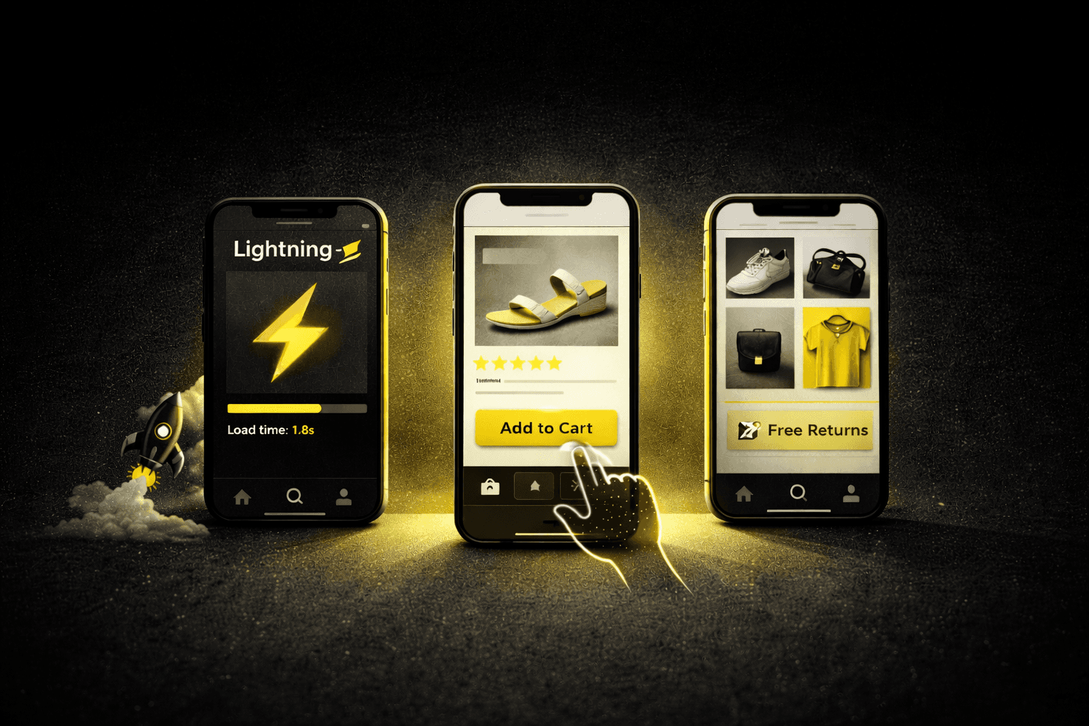
Speed: Target sub-3-second load times. WebP images, lazy loading, and theme audits are the primary levers. Each additional second costs 7% in conversions.
Touch design: Minimum 44×44px tap targets. Move add-to-cart buttons below product photos. Expose top categories directly — don't hide everything in a hamburger menu.
Visual hierarchy: Full-width swipeable images. 16px+ font sizes. 40% more spacing than you think you need.
Checkout: Enable Shop Pay or guest checkout. Trust signals above the add-to-cart button outperform security badges.
Testing: Mobile A/B tests need 10,000–15,000 visitors per variant. Run one test every two weeks and let improvements compound.
Most ecommerce managers check their desktop conversion rates and feel reasonably satisfied. Then they look at mobile — where three-quarters of their traffic lives — and the story changes entirely.
Mobile accounts for 76% of all ecommerce visits. Mobile transactions account for just 62% of total sales. That 14-point gap is not a traffic problem. It is a design problem — and it represents millions in revenue that stores are generating the traffic for but failing to capture.
Mobile-first Shopify design addresses this directly. Not by scaling down a desktop experience, but by building upward from the smaller screen — ensuring every element serves the thumb-scrolling majority before enhancing for larger displays. Here is exactly what that looks like in practice.
Mobile traffic
76%
Mobile sales
62%
The 14-point gap between mobile traffic and mobile sales is the revenue opportunity mobile-first design closes.
53%
of mobile users abandon sites taking over 3 seconds to load (Google)
85%
mobile cart abandonment rate — nearly 10 points higher than desktop
1.72×
higher mobile conversion rate with Shop Pay vs. manual checkout
Fix 1 of 5
Performance Foundation: Speed Is the First Conversion Optimization
Speed is not a technical nice-to-have. It is the first conversion optimization. Google's research shows that 53% of mobile users abandon sites taking longer than three seconds to load — and every additional second decreases conversions by 7%. On mobile networks, this problem is amplified by bandwidth constraints that desktop users never encounter.
🖼️ Convert product images to WebP format 30–40% smaller file sizesImage files are the largest performance bottleneck on most Shopify stores. Converting to WebP reduces file sizes by 30–40% without visible quality loss. Pair this with lazy loading — which ensures only visible images consume bandwidth on initial load — and the combined effect on load time is immediate and significant.
🎨 Audit your theme for mobile performance — not just aesthetics Glossier: 4.2s → 2.1s, +23% mobile CVRTheme selection impacts performance more than most merchants realize. Shopify's Dawn theme loads in 1.8 seconds on average mobile connections; older themes often require 4–5 seconds. Beauty brand Glossier reduced their mobile load time from 4.2 to 2.1 seconds by migrating to a performance-optimized theme — and saw a 23% increase in mobile conversions as a direct result.
🧹 Audit and cut your app stack below 8 appsEach installed app adds JavaScript that executes on every page load regardless of whether that page uses the app's functionality. Stores carrying more than eight apps typically see load times exceed three seconds. Regular audits identifying redundant or rarely-used apps preserve the lean codebase that mobile networks demand. This is one of the most common sources of silent speed degradation in established Shopify stores.
Fix 2 of 5
Touch-Optimized Interface Design: Built for Fingers, Not Cursors
Fingers are less precise than mouse cursors — and yet most responsive Shopify themes simply shrink desktop elements rather than redesigning for touch. Apple's Human Interface Guidelines recommend minimum tap targets of 44×44 pixels. Analytics from 500 Shopify stores reveal that 68% use buttons smaller than 40 pixels on mobile. That is a conversion problem hiding as a design decision.
☰ Replace hamburger menus with persistent bottom navigation for key categories Outdoor Voices: +41% category visitsHamburger menus reduce visual clutter but increase interaction cost — every core category is hidden behind an extra tap. Athletic apparel retailer Outdoor Voices tested exposing top categories directly in a persistent bottom navigation bar. Category page visits increased by 41% compared to their previous hamburger menu. The extra visibility more than offset any aesthetic trade-off.
🛒 Move the add-to-cart button directly below product photos Article: +18% mobile conversionsDesktop layouts that place add-to-cart buttons beside product images frequently push the purchase button below the fold on mobile screens. Furniture retailer Article moved their purchase button directly below product photos and saw an 18% increase in mobile conversions. If your primary CTA requires scrolling to find, you are losing sales to layout, not intent.
⌨️ Optimize every form field for mobile inputForm fields are the highest friction point in mobile checkout. Auto-fill compatibility, appropriate input types (numeric keyboards for phone numbers, email keyboards for email addresses), and minimal required fields all reduce abandonment meaningfully. Shopify's Shop Pay addresses this at the platform level by storing customer information for one-tap checkout across participating stores.
Fix 3 of 5
Visual Hierarchy for Small Screens: Ruthless Prioritization
Limited screen real estate demands a different approach to information hierarchy. Every element above the fold either advances the purchase decision or wastes irreplaceable space. Heat mapping data from 250 Shopify stores shows that mobile users rarely scroll past three screen heights on product pages — which means anything below that threshold needs to earn its placement.
📱 Switch to full-width swipeable image galleries Everlane: +34% product page engagementDesktop users expect multiple product angles displayed simultaneously. Mobile shoppers engage better with large, swipeable galleries that take up the full screen width. Fashion retailer Everlane increased mobile product page engagement by 34% after switching from a grid of small thumbnails to full-width swipeable images. The interaction pattern matches how people naturally use their phones.
📝 Use 16px minimum font size — never smallerFont sizes below 16 pixels trigger automatic zoom on iOS, disrupting the browsing flow and forcing users to manually reset their view. Line length also matters on narrow screens — 50–75 characters per line is the optimal range for readability, translating to roughly 20–30 words on most mobile displays. Typography is not decoration; it determines whether your copy gets read.
⬜ Add significantly more whitespace than feels comfortable The Ordinary: −19% bounce rateWhitespace prevents cognitive overload on small displays. Skincare brand The Ordinary redesigned their mobile product pages with 40% more spacing between elements — and reduced bounce rates by 19% despite showing less information above the fold. The breathing room helped shoppers process each element before scrolling rather than abandoning from overwhelm.
Fix 4 of 5
Mobile-Specific Conversion Optimization: Different Problem, Different Fix
Shopping cart abandonment on mobile reaches 85% — nearly 10 points higher than desktop. The causes differ from desktop abandonment in important ways, which means responsive versions of desktop fixes rarely work. Mobile requires its own set of interventions.
🛡️ Place "Free returns" messaging above the add-to-cart button — not security badges Allbirds: +12% mobile CVRTrust signals carry more weight on mobile where limited screen space restricts how much information displays simultaneously. Footwear brand Allbirds tested mobile trust elements and found that adding "Free returns" messaging above the add-to-cart button increased conversions by 12%. Security badges, by contrast, had no measurable impact. Customer-facing reassurance outperforms technical credibility signals on small screens.
💳 Enable Shop Pay or guest checkout — eliminate friction at payment 1.72× higher mobile CVR with Shop PayShopify's data shows that stores using Shop Pay see mobile conversion rates 1.72 times higher than those requiring manual checkout entry. For stores not using Shop Pay, minimizing form fields and enabling guest checkout are the most impactful alternatives. The checkout flow is where mobile's form-filling friction is most punishing — every field eliminated directly improves completion rates.
🚪 Use mobile-specific exit-intent triggers Anker: recovered 8% of abandoning sessionsMobile exit-intent works differently than desktop — there is no cursor to track. Mobile triggers fire when users navigate away from the tab or make rapid scroll movements. Electronics retailer Anker tested mobile-specific exit offers and recovered 8% of abandoning mobile sessions. Desktop traditional exit-intent recovered 12%, but the mobile-specific approach recovered sessions that would otherwise have been completely lost.
Fix 5 of 5
Testing and Iteration: How to Know What's Actually Working on Mobile
Mobile user behavior varies significantly by device, network speed, and context. A responsive theme performing well on newer iPhones might frustrate Android users on 3G connections. Comprehensive testing requires real devices — not just browser emulators — and larger sample sizes than most merchants expect.
🔥 Use heat maps and session recordings to find where mobile users actually tapHeat mapping tools like Hotjar reveal where mobile users tap, scroll, and abandon — information that aggregate analytics cannot surface. Outdoor gear retailer REI discovered through session recordings that 34% of mobile users attempted to tap non-clickable product photos — a friction point invisible in conversion rate data. They made all product images tappable for zoom, directly addressing a behavior pattern they would never have found otherwise.
🧪 Plan for 10,000–15,000 visitors per variant on mobile A/B testsMobile A/B tests require larger sample sizes than desktop due to higher variability in connection speeds and device capabilities. Desktop tests might reach statistical significance with 5,000 visitors per variant; mobile tests typically need 10,000–15,000 for reliable results. Calling a test early on mobile is one of the most common ways merchants implement changes that hurt rather than help.
📈 Run one mobile test every two weeks and let improvements compound Burrow: +47% mobile CVR over 18 monthsHome goods retailer Burrow runs continuous mobile optimization, testing one element every two weeks. Over 18 months, their accumulated improvements increased mobile conversion rates by 47% — with no single test contributing more than 6% individually. The compounding effect of consistent incremental improvement is what separates stores that steadily close the mobile gap from those that make one big push and plateau.
Mobile Optimization Audit Checklist
Before investing in new mobile features, verify these fundamentals are in place:
Mobile load time under 3 seconds (test at PageSpeed Insights and GTmetrix)
All product images converted to WebP with lazy loading enabled
App stack audited — fewer than 8 apps installed and active
All tap targets at 44×44px minimum (test on a real device, not emulator)
Add-to-cart button visible without scrolling on product pages
Guest checkout enabled — no forced account creation
Font sizes 16px or larger across all pages
Product images use full-width swipeable gallery format
Form fields trigger correct mobile keyboards (numeric, email, etc.)
Trust messaging ("Free returns", "Easy exchanges") visible above add-to-cart
Session replay running on mobile traffic (Hotjar or Microsoft Clarity)
The Bottom Line
Mobile-first Shopify design is not a trend — it is the correct response to where your customers already are. Three-quarters of your traffic arrives on a phone. Designing primarily for desktop and scaling down is working against the majority of your visitors from the first pixel.
The stores seeing the strongest mobile performance share consistent characteristics: sub-three-second load times, interfaces sized for fingers rather than cursors, ruthlessly simplified visual hierarchies, and checkout flows that eliminate every unnecessary step. These elements combine to create experiences that respect mobile shoppers' time — and close the gap between mobile traffic and mobile revenue.
The path forward is systematic, not dramatic. Audit current mobile performance against the checklist above, prioritize the highest-impact gaps, and commit to testing one change every two weeks. The stores that close the mobile conversion gap do not do it with one big redesign. They do it by letting small improvements compound over 12–18 months — which is exactly what the data from Burrow, Glossier, and Outdoor Voices shows.
FAQs
Why is my Shopify mobile conversion rate so much lower than desktop?
The gap between mobile traffic and mobile conversions is almost always caused by a combination of slow load times, touch-unfriendly design (buttons too small, CTAs below the fold), friction in checkout (required account creation, too many form fields), and visual hierarchy that was designed for desktop screens. Each of these is a separate, fixable problem. The average Shopify store has all four — which is why the industry-wide mobile conversion gap is 14 percentage points.
What is a good mobile conversion rate for a Shopify store?
Industry benchmarks put average mobile conversion rates at 1.5–2.5%. Well-optimized Shopify stores on mobile reach 3–4%. The gap between average and well-optimized is almost entirely explained by load speed, touch-optimized design, and checkout friction — not product quality or traffic source. If you are below 1.5% on mobile, a speed and UX audit will typically identify the specific causes.
How do I speed up my Shopify store on mobile?
Four changes produce the most impact in order of magnitude: convert all product images to WebP format (30–40% file size reduction), enable lazy loading so images below the fold do not load until needed, audit your installed apps and remove any with redundant or inactive functionality (each app adds JavaScript that runs on every page), and evaluate whether your current theme is performance-optimized. Shopify's Dawn theme loads in 1.8 seconds on average mobile connections — if your current theme takes 4+ seconds, migration is often the highest-ROI move available.
Should I use a hamburger menu or bottom navigation on mobile Shopify stores?
For stores with 5+ important product categories, a persistent bottom navigation bar outperforms a hamburger menu for conversion. Outdoor Voices saw a 41% increase in category page visits after switching from a hamburger menu to bottom navigation that exposed top categories directly. Hamburger menus reduce visual clutter but increase interaction cost — every important category is one extra tap away. Bottom navigation keeps primary pathways accessible throughout the browsing session.
Does Shop Pay actually improve mobile conversion rates?
Yes — significantly. Shopify's data shows that stores using Shop Pay see mobile conversion rates 1.72 times higher than those requiring manual checkout. The reason is direct: Shop Pay eliminates the form-filling friction that causes most mobile checkout abandonment. Stored customer information means returning customers complete checkout in one tap instead of re-entering their address and card details on a small keyboard. If you are eligible for Shop Pay, enabling it is one of the highest-impact changes available for mobile conversion.
How should I test mobile UX improvements on Shopify?
Three layers of testing work together: Google's PageSpeed Insights and Mobile-Friendly Test for baseline technical benchmarks, heat mapping and session replay tools (Hotjar or Microsoft Clarity) to see where real mobile users tap, scroll, and abandon, and A/B testing for validating specific changes before full rollout. Mobile A/B tests need 10,000–15,000 visitors per variant to reach statistical reliability — significantly more than desktop tests. Test one element at a time, every two weeks, and let the compounding effect of consistent small improvements build over months rather than expecting one change to solve the gap.
insights


