Shopify UX Best Practices That Improve Conversion Rates in 2026
Shopify UX Best Practices That Improve Conversion Rates in 2026
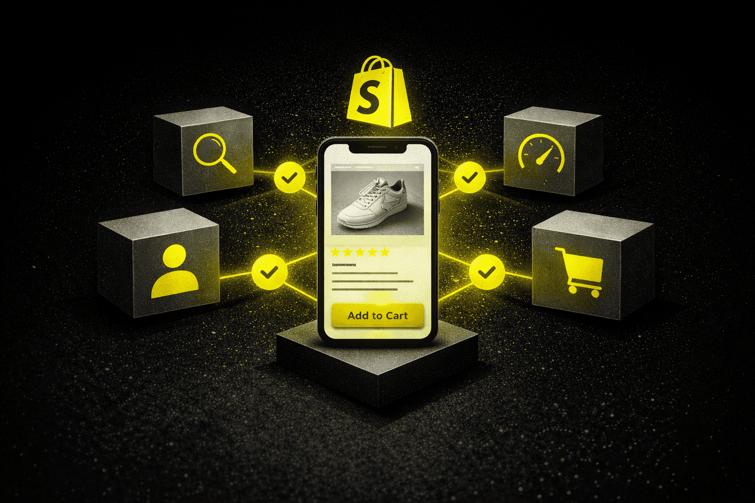
Cart abandonment averages 69.8% on Shopify stores. Low conversion rates are almost never a traffic problem. They are a UX problem. Here are the specific, data-backed fixes that actually move the number, covering navigation, product pages, checkout flow, mobile design, and page speed optimization.
Cart abandonment averages 69.8% on Shopify stores. Low conversion rates are almost never a traffic problem. They are a UX problem. Here are the specific, data-backed fixes that actually move the number, covering navigation, product pages, checkout flow, mobile design, and page speed optimization.
08 min read
Most Shopify store owners reach the same uncomfortable realization at some point. Traffic numbers look reasonable. Ad spend is going up. But conversion rates stay stubbornly flat, and adding more budget only amplifies the problem because more visitors are hitting the same friction points at greater cost.
The gap between visitors and buyers almost always comes down to user experience. Not branding. Not product photography. Not the color of the add-to-cart button. The specific, structural friction that sits between a customer's intent and a completed purchase. A checkout process that takes seven clicks instead of three can reduce conversions by 35%, and most store owners never trace the drop back to that specific cause because it does not show up obviously in any single metric.
Cart abandonment averages 69.8% across Shopify stores. Most of that is recoverable. Not through more retargeting spend or deeper discounts, but through specific, testable UX improvements that reduce friction at the moments it costs the most.
The stores converting at rates meaningfully above their category benchmarks share specific characteristics. They anticipate customer questions before they arise. They reduce cognitive load at critical decision points. They treat UX optimization as an ongoing operational discipline rather than a launch-week project. And they measure results against baselines rather than making one-off changes and moving on. This guide covers exactly what that looks like across the five highest-impact areas of Shopify UX in 2026.
The Numbers Before You Read Further
Cart abandonment averages 69.8% across Shopify stores and most of it is recoverable through UX fixes
Visitors who find products within two clicks convert at rates 67% higher than those requiring four or more navigation steps
A seven-click checkout versus a three-click checkout reduces conversions by 35%
Every additional second of mobile load time reduces conversions by 12%
Unexpected shipping fees cause 55% of cart abandonment incidents
UX Area 1: Navigation Architecture
Navigation is not a cosmetic decision. It is a revenue decision. The relationship between navigation structure and conversion becomes clear the moment you look at heatmap data from real sessions. Visitors who find products within two clicks convert at rates 67% higher than those requiring four or more steps. Every unnecessary click between landing and product is a conversion leak.
Use mega menus for large catalogs. Traditional dropdown menus work adequately for small product ranges. For stores with more than four or five primary categories, mega menus with visual product groupings and thumbnail images perform significantly better. When outdoor retailer Backcountry restructured their navigation this way, category page engagement increased 43% within the first month. The visual context reduces cognitive load at the moment a customer is deciding where to go next.
Add image autocomplete to site search. Autocomplete suggestions that display product images alongside text results produce 28% higher click-through rates than text-only alternatives. Equally important is synonym recognition. A customer searching "sneakers" should see results tagged as "athletic shoes." Missing synonyms silently kill search-driven conversions because the customer sees no results, assumes you do not carry what they want, and leaves. They were never told the product existed under a different name.
Add breadcrumb navigation for stores with deep category structures. Breadcrumbs provide orientation without cluttering the interface and become essential for stores with three or more category levels. Customers exploring subcategories need clear pathways back to broader collections without relying on the browser back button, which often removes items from session context and forces them to start the journey over.
The principle across all three: remove every step between a customer's intent and the product they are looking for. Each step you remove is a friction point eliminated and a conversion leak closed.
UX Area 2: Product Pages
Product pages carry the heaviest conversion burden in any Shopify store. The average visitor spends just 47 seconds on a product page before deciding to add to cart or navigate away. Every element on that page is either removing a purchase barrier or creating one. There is no neutral.
Provide at least six high-resolution images with zoom capability. Stores offering at least six images from different angles see 40% fewer product returns than those offering three or fewer views. Zoom functionality should reach at least 1,200 pixels to allow meaningful inspection of textures, materials, and construction quality. For apparel, furniture, and anything with significant tactile purchase criteria, image completeness is not a nice-to-have. It is the product page doing its primary job.
Structure descriptions with a clear information hierarchy. Technical specifications belong in expandable accordions, not dense paragraphs that force the customer to hunt for the one detail they need. Bullet points work for feature lists. Benefit-led prose performs better for emotional purchase drivers. The goal is answering the customer's most likely question within the first scroll, then making deeper detail accessible for those who want it without forcing it on those who do not.
Show verified reviews with photo uploads. Verified purchase reviews with photo uploads generate 112% more trust than text-only testimonials according to Spiegel Research Center data. The photo matters because it confirms the review is from a real person who actually received the product. Review filtering by star rating and product attribute helps customers find feedback relevant to their specific concern, which matters significantly more than the aggregate score for high-consideration purchases.
Add interactive size guides for apparel and fit-dependent products. Apparel brand Everlane reduced their return rate by 22% after implementing an interactive size calculator that accounts for actual garment measurements and customer fit preferences rather than generic size charts. Returns are a conversion problem that shows up as a margin problem. Solving the UX issue that causes wrong-size purchases fixes both simultaneously.
UX Area 3: Checkout Flow
Cart abandonment at 69.8% across Shopify stores is not primarily a retargeting problem. It is a checkout UX problem. The majority of abandonment happens because of specific, fixable friction points that cause customers to exit during the final steps of a purchase they had already decided to make.
The single largest driver of abandonment is unexpected costs. Unexpected shipping fees cause 55% of cart abandonment incidents. Displaying estimated total costs early in the checkout process, even before final calculation is complete, sets appropriate expectations and prevents last-minute exits when the true total appears. The customer who sees an estimated $8 shipping fee early converts at a significantly higher rate than one who sees the same $8 fee for the first time at the final confirmation step.
Enable guest checkout without exception. Forcing account creation before purchase increases abandonment by 34%. Authentication can wait until after the transaction completes. Furniture retailer Article saw a 28% increase in first-time customer conversions after removing their registration requirement. The account can be offered post-purchase as a convenience. The barrier cannot exist pre-purchase as a requirement. Customers who have decided to buy and are stopped by a mandatory registration form frequently do not complete the journey.
Add progress indicators to multi-step checkouts. Visual confirmation of where a customer is in the process, such as step two of three, helps them understand the time investment required before they commit to continuing. Single-page checkouts perform better for stores with simple shipping configurations. Multi-step flows suit complex international setups. The format should match the actual complexity of the transaction, not the one that looks cleaner in a design review.
Implement address autocomplete. Address autocomplete reduces input errors by 47% while saving customers an average of 12 seconds per transaction. On mobile, this is frequently the difference between a completed purchase and an abandoned one. Numeric fields should trigger number pads rather than full QWERTY keyboards. These details are invisible to customers when they work correctly and conversion-killing when they do not.
UX Area 4: Mobile Experience
Mobile represents 67% of Shopify traffic. Mobile conversion rates lag desktop by an average of 2.1 percentage points. That gap is not a reflection of mobile user preferences or reduced purchase intent on mobile. It is a UX failure on the part of most stores, and it represents significant recoverable revenue because the fixes are specific and testable.
Design for thumb reach, not cursor precision. Primary call-to-action buttons belong in the lower third of the screen where thumbs naturally rest during one-handed phone use. Navigation elements placed at the top of the screen require awkward hand repositioning that most users do not bother with, particularly when browsing casually. This single design principle affects every interaction on every page for every mobile visitor and costs nothing to implement in a theme adjustment.
Target sub-1.8 second mobile load times. Each additional second of mobile load time reduces conversions by 12%. Beauty brand Glossier achieved 1.8-second mobile load times through aggressive image optimization and saw a 32% increase in mobile conversions as a direct result. Image compression, lazy loading, and reduced third-party script calls are the three primary levers. Most Shopify stores have 15 to 20 unoptimized images on their homepage alone. Fixing this requires no design changes and produces immediate measurable improvement.
Add sticky add-to-cart buttons on product pages. Sticky add-to-cart buttons maintain visibility as customers scroll through long product descriptions, reviews, and specifications, keeping the primary action accessible throughout the browsing experience rather than requiring the customer to scroll back to the top to act. This increases mobile add-to-cart rates by 18% and costs almost nothing to implement. It does not require an A/B test to justify because the behavioral logic is straightforward: if the button is always visible, the customer never has to find it.
UX Area 5: Performance Metrics Beyond Conversion Rate
Data-driven UX optimization requires tracking specific technical metrics that most store owners never monitor but that predict conversion performance before it shows up in revenue numbers. By the time a UX problem is visible in conversion rate, it has typically been affecting performance for days or weeks.
Metric
What It Measures
Target
Time to Interactive
How quickly pages become fully functional for user input
Under 3.5 seconds
First Contentful Paint
When customers see the first meaningful page elements
Under 1.2 seconds
Bounce rate by page speed
Pages rendering in 1.2 seconds maintain 41% lower bounce rates
Compare fast vs slow pages
Click depth
Where customers abandon the journey before checkout
Identify pages with drop-off spikes
Mobile vs desktop conversion gap
Difference in conversion rate between devices
Under 1 percentage point
B&H Photo discovered through click depth analysis that 34% of mobile visitors were abandoning at their product comparison tool, a friction point that would never have surfaced from conversion rate data alone. A targeted redesign of that specific element improved flow-through by 26%. The problem was not visible in aggregate metrics. It was only visible when the data was examined at the page and interaction level.
Session replay tools provide the qualitative layer that quantitative data cannot. Watching actual customer sessions reveals confusion patterns that aggregate metrics obscure: rage clicks on non-interactive elements, repeated scrolling suggesting missing information, hesitation before form fields indicating uncertainty, and abandoned zoom gestures suggesting image quality concerns. These are specific UX problems with specific fixes. Aggregate conversion rate data tells you something is wrong. Session replay tells you what.
If you want ProjectSupply to run a UX audit on your Shopify store and identify exactly which friction points are costing the most conversions right now, start here.
What Metrics Should Drive Your UX Optimization Priorities?
Before making any UX changes, establish baselines for these metrics so improvements can be measured accurately rather than assumed.
Metric
How to measure it
What it tells you
Overall conversion rate
Orders divided by sessions
Baseline performance against which all improvements are measured
Mobile vs desktop conversion gap
Segment conversion rate by device in GA4
Size of the mobile UX opportunity
Checkout abandonment rate by step
GA4 funnel exploration report
Exactly which checkout step is losing the most customers
Product page bounce rate
GA4 page-level engagement report
Whether product pages are answering purchase questions
Site search exit rate
GA4 site search report
Whether customers who use search are finding what they need
Average click depth to purchase
GA4 path exploration
How many steps the current navigation requires to reach checkout
Forward View: Shopify UX in 2026 and Beyond
Three developments are changing what UX optimization requires for Shopify stores over the next 18 to 24 months.
AI-powered personalization is becoming accessible at the standard Shopify tier. Product recommendations, dynamic content sequencing, and personalized navigation based on browsing behavior were previously available only to enterprise brands with custom development budgets. Tools that deliver this capability are now integrated into standard Shopify apps at accessible price points. The stores that implement personalization infrastructure now will have conversion rate advantages that compound as their customer behavioral data grows.
Visual search and AI shopping assistants are changing how customers interact with product discovery. Consumers are increasingly comfortable asking AI tools for specific product recommendations and using visual search to find products matching an image or description. Shopify stores with complete product metadata, rich image coverage, and detailed specification data are better positioned to appear in AI-generated recommendations and visual search results. The UX investment in product page completeness pays off in discovery as well as conversion.
Mobile commerce standards are rising faster than most stores are keeping up. The gap between the mobile experience consumers receive from category leaders and the mobile experience provided by most Shopify stores is widening rather than narrowing. Consumers whose baseline mobile commerce experience is set by brands like Glossier, Gymshark, and Allbirds apply that standard to every purchase they make. Stores that meet that standard convert. Stores that fall short of it do not, regardless of how good the product is or how targeted the traffic is.
The principle that holds across all of these developments is the same one that has always driven conversion rate optimization: remove friction at the moments it costs the most, provide information when customers need it, and make the path to purchase obvious and efficient. The specific implementation evolves as technology and consumer expectations change. The underlying logic does not.
FAQs
What is the average Shopify store conversion rate?
The average Shopify store converts between 1.4% and 3.3% of visitors, with 2.5% commonly cited as the benchmark for a well-optimized store. Stores in the top quartile reach 3.5–5% through systematic UX optimization across navigation, product pages, checkout, and mobile experience. If your store is converting below 1.5%, UX friction — not traffic quality — is almost always the primary issue.
Why is my Shopify store getting traffic but no sales?
Traffic without sales almost always points to UX friction at a specific point in the customer journey. The most common culprits are: required account creation before checkout (adds 34% abandonment), unexpected shipping fees at the final checkout step (causes 55% of abandonment), fewer than six product images, missing or hard-to-find size guides, and mobile pages loading over two seconds. Run a session replay tool for one week — the friction points become obvious quickly.
How do I reduce cart abandonment on Shopify?
The highest-impact interventions in order of priority: enable guest checkout, display shipping costs before the final checkout step, add address autocomplete to reduce form friction, implement progress indicators in multi-step flows, and ensure mobile load times are under two seconds. These five changes address the majority of documented abandonment causes. Abandoned cart email sequences help recover what remains — but they do not fix the underlying UX issues driving the abandonment.
What are the most important product page elements for conversion?
In order of impact: six or more high-resolution images with zoom capability, verified reviews with photo uploads (these generate 112% more trust than text-only), a clear and scannable description structure with expandable specifications, an interactive size guide for apparel, and a sticky add-to-cart button on mobile. Missing any one of these creates a measurable drop in the percentage of visitors who add to cart.
How much does page speed affect Shopify conversion rates?
Each additional second of mobile load time reduces conversions by approximately 12%. A store loading in three seconds instead of one second loses roughly 24% of its potential mobile conversions before a visitor has seen a single product. First contentful paint under 1.2 seconds reduces bounce rates by 41% compared to slower alternatives. Page speed is the single UX variable with the broadest impact across every page type simultaneously.
What UX tools should Shopify store owners use?
A useful stack covers three layers: quantitative analytics (Google Analytics 4 with e-commerce tracking enabled, plus Shopify's own analytics for checkout funnel data), session replay tools (Hotjar or Microsoft Clarity) to watch real customer sessions and identify confusion patterns, and A/B testing infrastructure (Google Optimize or a Shopify-native tool) to validate changes before full rollout. Most stores only use the first layer — which is why the friction points in the second and third layers stay invisible for months.
Direct Answers
What is the most impactful UX change a Shopify store can make to improve conversion rate?
Enabling guest checkout is typically the single highest-impact change for stores still requiring account creation before purchase. Forced registration increases abandonment by 34%. For stores that already have guest checkout, the next highest-impact area is usually checkout fee transparency, since unexpected shipping costs cause 55% of cart abandonment incidents.
Why is my Shopify store's mobile conversion rate lower than desktop?
Almost always because of mobile-specific UX failures rather than differences in mobile user intent. The most common causes are slow mobile load times, call-to-action buttons positioned outside comfortable thumb reach, form fields that trigger the wrong keyboard type, and navigation designed for cursor precision rather than touch interaction. Each of these is a specific, testable fix rather than a fundamental platform limitation.
How many product images does a Shopify store need to maximize conversion?
A minimum of six high-resolution images from different angles, with zoom capability reaching at least 1,200 pixels. Stores providing six or more images see 40% fewer product returns than those with three or fewer. For apparel, lifestyle context images showing the product worn or in use should be included alongside technical product shots. Image completeness reduces purchase uncertainty and directly reduces returns.
What is the right mobile page load speed target for a Shopify store?
Under 1.8 seconds for first contentful paint on mobile. Each additional second above that reduces conversions by 12%. The primary levers are image compression, lazy loading of below-the-fold content, and reduction of third-party scripts. Most Shopify stores can achieve meaningful load time improvements without any theme changes simply by compressing existing images and auditing installed apps for unnecessary script calls.
How do I find out where customers are abandoning in my Shopify checkout?
Use GA4's funnel exploration report configured to track each step of your checkout flow as a distinct event. This shows exactly what percentage of customers exit at each step and allows you to identify which specific stage is producing the most abandonment. For granular session-level data, a session replay tool installed alongside GA4 shows the specific interactions that precede abandonment, which is often more actionable than the funnel data alone.
Should I use a single-page or multi-step checkout on Shopify?
Single-page checkout performs better for stores with simple shipping configurations and domestic-only sales. Multi-step checkout suits stores with complex international shipping, multiple payment method configurations, or high-consideration products where customers benefit from a slower, more deliberate purchase flow. The format should match the actual complexity of the transaction. Choosing based on what looks cleaner in a design review rather than what matches the transaction complexity is one of the most common checkout UX mistakes.