
Shopify
08 min read
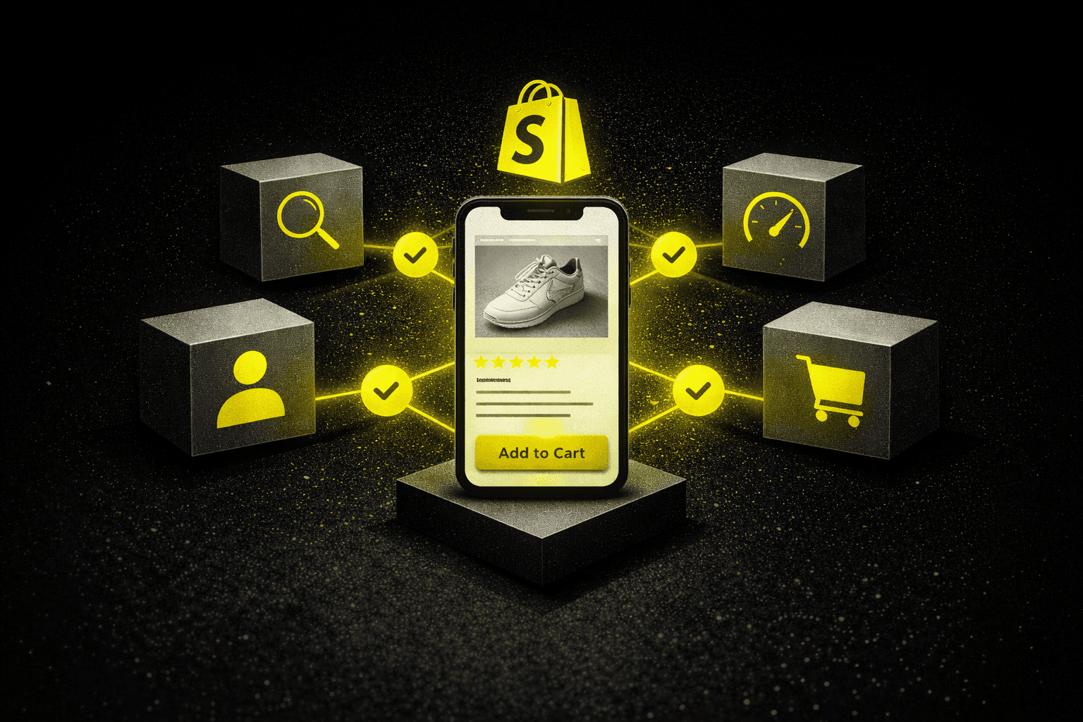
Shopify UX Best Practices That Improve Conversion Rates (2026)
February 18, 2026 · 8 min read · Ecommerce
The Core Insight Before You Read On
Traffic is rarely the problem. Low conversion rates are almost always a UX problem — friction at the wrong moments, missing information at the wrong pages, or a checkout process that costs customers too many steps.
The highest-impact areas: navigation depth, product page social proof, guest checkout, mobile interaction design, and page load speed.
Cart abandonment averages 69.8% across Shopify stores. Most of that is recoverable through specific, testable UX improvements — not more ad spend.
Treat it as a system, not a project. Stores with sustained conversion improvements test methodically and measure against baselines — they don't make one-off changes and move on.
Most Shopify store owners reach the same uncomfortable realization at some point. Traffic numbers look promising. But conversion rates stay stubbornly low — and adding more ad budget only amplifies the problem.
The gap between visitors and buyers almost always comes down to user experience. Small design decisions compound into measurable revenue differences. A checkout process that takes seven clicks instead of three can reduce conversions by 35% — and most store owners never trace the drop back to that specific friction point.
The stores converting at higher rates share specific characteristics: they anticipate customer questions before they arise, reduce cognitive load at critical decision points, and treat UX optimization as an ongoing process rather than a launch-week project. Here is exactly what that looks like in practice.
69.8%
Average cart abandonment across Shopify stores
67%
Higher conversion when products found in 2 clicks vs. 4+
35%
Conversion drop from 7-click vs. 3-click checkout
UX Area 1 of 5
Navigation Architecture: Getting Customers to Products Faster
The relationship between navigation structure and conversion becomes clear when you look at heat map data. Visitors who find products within two clicks convert at rates 67% higher than those requiring four or more navigation steps. Navigation is not a cosmetic decision — it is a revenue decision.
🗂️ Use mega menus for large catalogs +43% category engagementTraditional dropdowns work for small product ranges. For enterprise-scale catalogs, mega menus with visual product categories and thumbnail images perform significantly better. When outdoor retailer Backcountry restructured their navigation this way, category page engagement increased 43% within the first month.
🔍 Add image autocomplete to search +28% click-throughAutocomplete suggestions that display product images alongside text results produce 28% higher click-through rates than text-only alternatives. Equally important: synonym recognition. A customer searching "sneakers" should see results tagged as "athletic shoes." Missing synonyms silently kills search-driven conversions.
🧭 Add breadcrumb navigation for deep category structuresBreadcrumbs provide orientation without cluttering the interface — and they become essential for stores with three or more category levels. Customers exploring subcategories need clear pathways back to broader collections without relying on the browser back button, which often removes items from session context.
UX Area 2 of 5
Product Pages: Removing Every Reason Not to Buy
Product pages carry the heaviest conversion burden in any Shopify store. The average visitor spends just 47 seconds on a product page before deciding to add to cart or navigate away. Every element on that page either removes a purchase barrier or creates one.
🖼️ Offer 6+ high-resolution images with zoom capability 40% fewer returnsStores providing at least six high-resolution images from different angles see 40% fewer product returns than those offering three or fewer views. Zoom functionality should reach at least 1,200 pixels to allow meaningful inspection of textures and materials — particularly important for apparel, furniture, and anything with tactile purchase criteria.
📝 Structure descriptions with information hierarchyTechnical specifications belong in expandable accordions — not dense paragraphs. Bullet points work for feature lists, but benefit narratives perform better in short prose. The goal is answering the customer's most likely question within the first scroll, then making deeper detail available for those who want it.
⭐ Show verified reviews with photo uploads +112% trust vs. text-onlyVerified purchase reviews with photo uploads generate 112% more trust than text-only testimonials, according to Spiegel Research Center data. Review filtering by star rating and product attributes helps customers find feedback relevant to their specific concern — which matters more than the aggregate score.
📏 Add interactive size guides −22% returnsApparel brand Everlane reduced their return rate by 22% after implementing an interactive size calculator that accounts for garment measurements and customer fit preferences — not just generic size charts. Returns are a conversion-rate problem that shows up as a margin problem. Solving the UX issue fixes both.
UX Area 3 of 5
Checkout Flow: The Final Friction Points Before Revenue
Cart abandonment averages 69.8% across Shopify stores. The checkout experience accounts for the majority of that loss — and most of it is recoverable through specific, testable changes rather than more retargeting spend.
⚠️ The single biggest abandonment driver: Unexpected shipping fees cause 55% of cart abandonment incidents. Displaying estimated total costs early in the checkout process — even before final calculation — sets appropriate expectations and prevents last-minute exits.
🚪 Enable guest checkout — always −34% abandonmentForcing account creation before purchase increases abandonment by 34%. Authentication can wait until after the transaction completes. Furniture retailer Article saw a 28% increase in first-time customer conversions after removing their registration requirement. The account can be offered post-purchase; the barrier cannot exist pre-purchase.
📶 Add progress indicators to multi-step checkoutsVisual confirmation of "Step 2 of 3" helps customers understand the time investment required before they commit to continuing. Single-page checkouts work better for stores with simple shipping options; multi-step flows suit complex international configurations. Match the format to the actual complexity — not the one that looks cleaner in design mockups.
⌨️ Implement address autocomplete −47% input errorsAddress autocomplete reduces input errors by 47% while saving customers an average of 12 seconds per transaction. On mobile, this is the difference between a completed purchase and an abandoned one. Numeric fields should trigger number pads — not full QWERTY keyboards. These details are invisible when right and conversion-killing when wrong.
UX Area 4 of 5
Mobile Experience: Where the Conversion Gap Lives
Mobile represents 67% of Shopify traffic — and yet mobile conversion rates lag desktop by an average of 2.1 percentage points. That gap is not a mobile-user preference. It is a UX failure on the part of most stores. It represents recoverable revenue, and the fixes are specific.
👍 Design for thumb reach, not cursor precisionPrimary call-to-action buttons belong in the lower third of the screen — where thumbs naturally rest. Navigation elements placed at screen tops require awkward hand repositioning that most users simply do not bother with. This single change affects every interaction on every page for every mobile visitor.
⚡ Target sub-1.8 second mobile load times +32% conversionsEach additional second of mobile load time reduces conversions by 12%. Beauty brand Glossier achieved 1.8-second mobile load times through aggressive image optimization — and saw a 32% increase in mobile conversions as a direct result. Image compression, lazy loading, and reduced third-party scripts are the primary levers. Most Shopify stores have 15–20 unoptimized images on their homepage alone.
🛒 Add sticky add-to-cart buttons on product pages +18% add-to-cart rateSticky add-to-cart buttons maintain visibility as customers scroll through long product pages — keeping the primary action accessible throughout the browsing experience. This seemingly minor interface element increases mobile add-to-cart rates by 18%. It costs almost nothing to implement and requires no A/B test to justify.
UX Area 5 of 5
Performance Metrics: What to Measure Beyond Conversion Rate
Data-driven UX optimization requires tracking specific technical metrics that most store owners never look at — but that predict conversion performance before it shows up in revenue numbers.
Metric | What It Measures | Target Benchmark |
|---|---|---|
Time to Interactive (TTI) | How quickly pages become fully functional | Under 3.5 seconds |
First Contentful Paint (FCP) | When customers see initial page elements | Under 1.2 seconds |
Bounce rate (slow pages) | Pages rendering in 1.2s maintain 41% lower bounce rates than slower alternatives | Compare fast vs. slow pages |
Click depth | Where customers abandon before checkout | Identify pages with drop-off spikes |
B&H Photo discovered through click depth analysis that 34% of mobile visitors abandoned at their comparison tool — a friction point that would never have surfaced from conversion rate data alone. A targeted redesign improved flow-through by 26%.
Session replay tools provide the qualitative layer that quantitative data cannot. Watching actual customer sessions reveals confusion points that aggregate metrics obscure — rage clicks, repeated scrolling, hesitation before form fields, and abandoned zoom gestures all indicate specific UX problems requiring attention.
✅ Always test before shipping: A/B testing validates optimization hypotheses before full implementation. Even apparently minor changes deserve testing — changing a button color from green to orange produced a 21% conversion lift for Performable by creating better contrast against their background. "Obviously good" UX changes that skip testing often underperform or backfire.
The Bottom Line
Shopify UX best practices continue evolving alongside changing consumer expectations and device capabilities. But the fundamentals remain consistent: reduce friction at decision points, provide information when customers need it, and make the path to purchase obvious and efficient.
The stores achieving sustained conversion improvements treat optimization as systematic rather than sporadic. They test changes methodically. They measure results against baseline performance. They recognize that small improvements compound into significant revenue differences — and that the compounding only happens when changes are implemented consistently, not in bursts after a bad month.
Speed matters, but not at the expense of necessary information. Simplicity improves conversion, but oversimplification leaves questions unanswered. The right balance depends on your specific audience and product complexity — which is exactly why testing against your own data matters more than any benchmark.
For stores ready to move past guesswork, start with a UX audit that maps current friction points against actual customer behavior data. The improvements worth making are almost never the ones that look best in design reviews — they are the ones that directly address where customers are currently dropping off.
FAQs
What is the average Shopify store conversion rate?
The average Shopify store converts between 1.4% and 3.3% of visitors, with 2.5% commonly cited as the benchmark for a well-optimized store. Stores in the top quartile reach 3.5–5% through systematic UX optimization across navigation, product pages, checkout, and mobile experience. If your store is converting below 1.5%, UX friction — not traffic quality — is almost always the primary issue.
Why is my Shopify store getting traffic but no sales?
Traffic without sales almost always points to UX friction at a specific point in the customer journey. The most common culprits are: required account creation before checkout (adds 34% abandonment), unexpected shipping fees at the final checkout step (causes 55% of abandonment), fewer than six product images, missing or hard-to-find size guides, and mobile pages loading over two seconds. Run a session replay tool for one week — the friction points become obvious quickly.
How do I reduce cart abandonment on Shopify?
The highest-impact interventions in order of priority: enable guest checkout, display shipping costs before the final checkout step, add address autocomplete to reduce form friction, implement progress indicators in multi-step flows, and ensure mobile load times are under two seconds. These five changes address the majority of documented abandonment causes. Abandoned cart email sequences help recover what remains — but they do not fix the underlying UX issues driving the abandonment.
What are the most important product page elements for conversion?
In order of impact: six or more high-resolution images with zoom capability, verified reviews with photo uploads (these generate 112% more trust than text-only), a clear and scannable description structure with expandable specifications, an interactive size guide for apparel, and a sticky add-to-cart button on mobile. Missing any one of these creates a measurable drop in the percentage of visitors who add to cart.
How much does page speed affect Shopify conversion rates?
Each additional second of mobile load time reduces conversions by approximately 12%. A store loading in three seconds instead of one second loses roughly 24% of its potential mobile conversions before a visitor has seen a single product. First contentful paint under 1.2 seconds reduces bounce rates by 41% compared to slower alternatives. Page speed is the single UX variable with the broadest impact across every page type simultaneously.
What UX tools should Shopify store owners use?
A useful stack covers three layers: quantitative analytics (Google Analytics 4 with e-commerce tracking enabled, plus Shopify's own analytics for checkout funnel data), session replay tools (Hotjar or Microsoft Clarity) to watch real customer sessions and identify confusion patterns, and A/B testing infrastructure (Google Optimize or a Shopify-native tool) to validate changes before full rollout. Most stores only use the first layer — which is why the friction points in the second and third layers stay invisible for months.
INSIGHTS
Expert perspectives on design, AI, and growth.
Explore our latest strategies for scaling high-performance creative in a digital world.


View more
